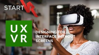
Virtual Reality UX - Designing for Interfaces without Screens
•
2 likes•650 views

Digital marketing has reached the point in its evolution where we know what the best practices are: A seamless omnichannel strategy, an emphasis on customer experience and the use of social media to co-create the brand with the customer, to name a few. digital marketing will soon be shifting into a new gear, as virtual reality (VR) and artificial intelligence (AI) begin to gain critical mass.

Recommended
Recommended
More Related Content
What's hot
What's hot (20)
Viewers also liked
Viewers also liked (20)
Similar to Virtual Reality UX - Designing for Interfaces without Screens
Similar to Virtual Reality UX - Designing for Interfaces without Screens (20)
Recently uploaded
Recently uploaded (20)
Virtual Reality UX - Designing for Interfaces without Screens
- 2. UX experts are used to designing forms, websites and smartphone applications. Now they need to re-learn the trade to design interfaces and interactions in virtual reality.
- 3. As a medium, there are very few existing standards, protocols, and workflows. It’s like participating in film before cinematography had shot names, or like participating in the internet before “web designer” was a position.
- 4. Many of the traditional UI elements simply do not work in VR, and a significant part of the existing UX toolkit is simply inappropriate.
- 5. To begin with, designing for a flat surface - our laptop or phone screens - is very different from designing for a spherical world with the user at its centre.
- 7. Curved design You need to stop thinking about the canvas as a surface, and imagine it as a sphere.
- 8. Put it into a VR enviroment, and it just doesn't work, especially if it's too wide or tall. The edges of a flat surface will be further away from the user's eye focus, making them blurry and hard to read. Take an element as simple as a rectangle, a picture or a video player.
- 9. Narrowing the Field In VR placing any meaningful control element to the periphery of the field of vision is a bad idea.
- 10. Take an element as simple as a rectangle, a picture or a video player. Put it into a VR enviroment, and it just doesn't work, especially if it's too wide or tall. The edges of a flat surface will be further away from the user's eye focus, making them blurry and hard to read. It's simple biology: your vision is simply not sharp enough on the edges.
- 11. Using Z Zones and Depth Objects that are too close to your eyes will get blurry.
- 12. Just raise your hand and start moving it towards your face - you simply can't maintain focus when it's closer than a few inches. Objects, and especially controls should never be placed too close to the user. On the other hand people are much better in telling the distance between two objects in close distance, than between two objects far away. If the distance is important from an interaction point of view, the objects should be placed reasonably close to the user's eyes.
- 13. Motion flow In virtual reality the camera is mapped to the player's head, with it's focus being at the centre (unless you use eye tracking)
- 14. This means you should never change the environment against the head movements, or force the user turn their head involutarily. Both leads to motion sickness, and being nauseated.
- 15. Of course sometimes you want to guide the user through the user interface, towards the direction where something is happening. This is where subtle tools like motion flow comes into play. Pressing a button can trigger the button to extend, or slowly start moving, gently guiding the user to turn their head. We are implying a direction, guiding their eye to the next point of interest.
- 16. Moving Interface It's the opposite of motion flow, when we don't urge the user to look in a specific direction, but rather move the new elements directly to the field of view.
- 17. Standing the the centre of a sphere means you don't see, and you don't know about UI elements changing behind your back. Sometimes it's better to put them right in the front of the user.
- 18. Capturing attention The long evolution of the Homo Sapiens trained us to pay attention to lights and movement - otherwise we probably won't be here, and predators would rule the Earth. This evolutionary skill is perfect to capture focus in a virtual reality environment.
- 19. A great example is the game demo Lost by Oculus: they use fireflies in a dark forest to lead the eyes of the user. We expect to see more subtle, clever plays on light and shadow in VR applications and games.
- 20. Anchor objects Virtual reality causes dizziness for a lot of people. Chances are if you had a bad experience with VR you won't try it again - and definitely won't try it the third time.
- 21. We are used to standing or sitting still while the world is moving around us, a good example being driving. It's not causing nausea, because we have a visual anchor, the car dashboard. Establishing such an anchor object in the virtual space is something interface designers should consider.
- 22. Research suggests even a virtual nose can help. We all see our nose all the time anyway, right?
- 23. Holophonic sound Holophonic sounds are amazing in games, but they very well might be used for VR control interfaces.
- 24. Holophonic means 3D sound (the word itself rhymes with holography). The idea is that with listening through the right equipment you can tell if the sound is coming from above, below, or from behind your back (and not just left and right, as with the stereo systems). Imagine a video start playing outside of your view, and you will hear _exactly_ where the sound comes from. We are not quite there yet, but not that far either.
- 25. Best Practice UX 1. Virtual experiences are simply better together 2. Virtuality is more impactful when it’s seamless with reality 3. Virtuality should be comfortable
- 26. http://realityshift.io/blog/ui-ux-design-patterns-in-virtual-reality http://www.uxofvr.com/ http://www.cmswire.com/digital-marketing/artificial-intelligence-virtual-reality-and-the-future-of-digital-marketing/ http://www.forbes.com/sites/tomaslaurinavicius/2016/12/04/ux-trends-2017/#52f680857c94 Mike Alger: https://vimeo.com/141330081 - VR Interface Design Pre-Visualisation Methods https://vimeo.com/116101132 - VR Interface Design Manifesto https://drive.google.com/file/d/0B19l7cJ7tVJyRkpUM0hVYmxJQ0k/view UX Links / References
- 27. HOW WE CAN HELP YOU… SYDNEY / LONDON / SAN FRANCISCO VR UK FOR BRANDED CONTENT
- 28. CUSTOM USER INTERFACE VR CONTENT MENU When users enter your VR world, they need a point of entry into your experience. This is similar to a website home page. It is the main hub for all your VR content. How can you creatively us VR to enhance this point of entry?
- 29. START VR CONTENT FORMATS SUMMARY
- 30. IMMERSIVE VR NARRATIVE THE EXPERIENCE 1. IMMERSION 4. PRESENCE3. AGENCY 2. EMBODIMENT Our unique VR storytelling UX framework offers an immersive, sensory and interactive content experience for your audience.
- 31. CUSTOM UI 360 VIDEO ASSETS UX DESIGN PUBLISHING ANALYTICS VR APPLICATION FRAMEWORK
- 32. VR DELIVERY MULTI PLATFORM With our Startgate VR platform content can be uploaded once and then easily published to Samsung Gear VR, Oculus Rift and HTC Vive devices
- 33. RHIANNON MONKS RHIANNON@STARTVR.CO SYDNEY / LONDON / SAN FRANCISCO WANNA SEE A DEMO…?