design, web design, usability
•
1 like•689 views

The document discusses why all uppercase text is less readable, especially for long passages. It notes that studies have shown all caps text is 40% less readable. It explains that when reading, we recognize whole words rather than individual letters, and uppercase/lowercase letters give words a distinctive shape that aids recognition. Breaking up the uppercase text disrupts this recognition process. The document recommends avoiding all caps for lengthy texts, while it can be used for titles, short phrases or emphasis. White space should also be used to avoid disturbing the flow of reading.

Recommended
More Related Content
Similar to design, web design, usability
Similar to design, web design, usability (20)
More from Roberto Dadda
More from Roberto Dadda (20)
design, web design, usability
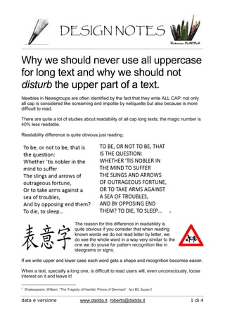
- 1. DESIGN NOTES data e versione www.dadda.it roberto@dadda.it 1 di 4 Why we should never use all uppercase for long text and why we should not disturb the upper part of a text. Newbies in Newsgroups are often identified by the fact that they write ALL CAP: not only all cap is considered like screaming and impolite by netiquette but also because is more difficult to read. There are quite a lot of studies about readability of all cap long texts; the magic number is 40% less readable. Readability difference is quite obvious just reading: 1 The reason for this difference in readability is quite obvious if you consider that when reading known words we do not read letter by letter, we do see the whole word in a way very similar to the one we do youse for pattern recognition like in ideograms or signs. If we write upper and lower case each word gets a shape and recognition becomes easier. When a text, specially a long one, is difficult to read users will, even unconsciously, loose interest on it and leave it! 1 Shakespeare, William, “The Tragedy of Hamlet, Prince of Denmark“ Act III, Scene I
- 2. DESIGN NOTES data e versione www.dadda.it roberto@dadda.it 2 di 4 We may go even further with our experiments, try to read this text: Difficult, even if you have just encountered the very same text in previous page if we take out the upper part of the words reading becomes VERY difficult! It looks like the lower part of the word shape is not so useful to identify words , maybe the upper part is. Let’s try to read the text in next page:
- 3. DESIGN NOTES data e versione www.dadda.it roberto@dadda.it 3 di 4 Definitely easier, isn’t? The upper part of words si the one we use more while reading. AND SO WHAT? 1) Avoid upper case only in lengthy texts 2) Is good for titles, for short phrases or to put emphasis on a word (consider bold also) 3) Give some space between lines and between the first line of blocks and graphical elements to avoid disturbing the upper part of the text.
- 4. DESIGN NOTES data e versione www.dadda.it roberto@dadda.it 4 di 4 Older programmers like me know very well how hard is all cap reading because in the first fast printers of large computer systems lower case was not available: