
Recommended
More Related Content
Viewers also liked
Viewers also liked (18)
Similar to Magazine Front Cover Analysis 2
Similar to Magazine Front Cover Analysis 2 (20)
More from salinadaniel
More from salinadaniel (15)
Recently uploaded
Recently uploaded (20)
Magazine Front Cover Analysis 2
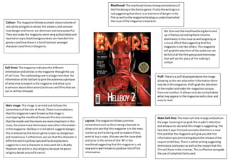
- 1. Colour: The magazine followsasimple colourscheme of red,white andgoldto attract the viewersandconnote howdangerand horror are dominantandverypowerful. Theyalsomake the magazine seemveryauthoritativeand layeredontopa black backgroundwe see howdark the genre isand howthere isa lotof contrast amongst characters andfilmsinthe genre. Sell-lines: The magazine indicatesthe different informationandarticlesinthe magazine throughthe use of sell lines.The subheadingsare inalargertextthan the informationatthe bottomto give the audience aglimpse of whatelse toexpectinthe magazine andallowusto readmore aboutotheractors/actressesandfilmsthatare out or will be released. We thensee the mastheadbeingburntand up inflamesconnotingthere ishorror dominance inthisissue aswell asgiving us a visual effectthatsuggestingthatthis magazine isnotlike others.Thismagazine will grabthe attentionof the audience can be full of all the filmgossipandinterviews that will setthe place of fire makingit unique. Puff: There is a puff displayedabove the image allowingusthe see whatotherinformationthere may be inthismagazine.Puffs grabthe attention of the readerandmake the magazinesunique fromone another.It allowsusto be excitedabout whatmay appearin the magazine andisclear and easyto read. Main Image: The image iscentredand followsthe conventionsof the rule of thirds.There isconnotations that thismagazine iswell knownasthe image is overlappingthe masthead,howeverthisalsoconnotes that the model andthe movie are more importantinthis issue,theyhave more dominance overotherinformation inthismagazine. Hellboyisinredwhichsuggestsdanger, thisisrelevantasthe horror genre isseenas dangerous and mysterious.Furthermore,we see thatthischaracteris differentandhisyelloweyesandfacial expressions suggesthe isnot a character to messwithhe is deadly. Howeverwe see he isalsoreligiousbecause he wears religiousbeadsaroundhiswrist. Masthead: The mastheadshowsstrongconnotationsof the filmbeinginthe horrorgenre.Firstlythe writingisin redsuggestingthatthere isan elementof dangerinthe filmaswell asthe magazine helpingusunderstandwhat the issue of the magazine isbasedon. Layout: The magazine followscommon conventionssuchasthere beingabarcode to allowusto see that thismagazine isinthe mass marketas well asbeingsoldtoreadersif they wantto buy a copy.Alsowe see the issue date and price inthe centre of the ‘M’ in the mastheadsuggestingthatthismagazine isnot newand iswell knowntoproduce lotsof film information. Main Sell-line: The main sell-line islarge andboldon the page meaningitcangrab the reader’sattention and allowusto see whatthisimage issuggesting.The fact that itsays firstlookconnotesthatthisisa new filmandthat thismagazine will give youthe first informationyouare hearingaboutthe release of the sequel toHell boy.There iswhite writingsuggesting dominance andpoweraswell asthe impactthat this filmwill have inthe cinemas.Thisiseffective alongside the use of simplisticfontsused.