1. Font
The font that they have
used is san-serif font;
this is because it creates
a fun and modern young
image for the magazine
which makes the target
audience more
intrigued. They have
also got some of the
headlines more bolder
than others this is
because they are eye
catching and these may
be the stories that are
much more in tresting
and the magazine would
like there readers to
read them first the first
thing that you would
see when you buy this
magazine is anything
that is bold, the
important things are in
bold.
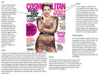
Colour
On this magazine cover there is
very high key colours, Miley Cyrus
is very saturated and they have put
her on a white back ground to
make her stand out, the cover is
bright which makes it clear to read
the headlines of the magazine, the
colures on the headlines are pink,
Back and orange, the pink out of all
the colures stands out the most as
there is a lot of it on the page
which makes it one of the main
colures. These colours apply to the
target audience as it is exciting and
fun for the c1,c2 target audience.
Mode of address
The mode of address is informal, they use
slag words to make it informal and to link
in well this the target audience, they
have use words like ‘sexy’ and ’perfect’
because they are informal words to link
with the magazine. This appeals to the
target audience as their target audience
group is c1 to c2 and that is what they
want to see on the cover in formal
language and features to link in with their
advantages.
Layout
The layout of the magazine is clear but cluttered, the cover lines are close
to Miley Cyrus but not covering her face because they don’t want to get
the headlines in the way of their cover star, there are 7 cover lines this is
because it make it fun to read and existed, they want to create a clean and
tidied up look for their cover, a another technique that likes in with high
end magazine is how they put their headlines and how they layout, at the
top of the page is the master head and Emma Watson face as they are the
2 most importance elements on the cover as when magazines are staked
on shelves the first thing the audience sees it the top, Emma Watson is
covering the master head as she is important and her star power, this
shows that they are confident brand and they have covered most of their
master head.
Feature
The features that they have used are very fun and
informal this is because they need to impress the
target audience which is c1, c2. This will also help the
audience escape and have a fun atmosphere when
they are feeling stressed, this allows them to lose
themselves in the magazine.