
Recommended
More Related Content
What's hot
What's hot (20)
Viewers also liked
Viewers also liked (17)
Similar to Project #3: Brand Identity
Similar to Project #3: Brand Identity (20)
Recently uploaded
Recently uploaded (20)
Project #3: Brand Identity
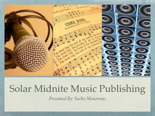
- 1. Solar Midnite Music Publishing Presented By: Sacha Matarran
- 2. Brand Name Behind The Name Solar Midnite is originally the song title of a hip-hop song released by Lupe Fiasco in 2002 that was recorded solely for the intent of appearing in the Twilight Movie. Solar Midnite Music Publishing is in no way affiliated with Lupe Fiasco, and because song titles are not classified as copyrighted content, we are within our rights to use the name. By definition Solar Midnight is that time opposite of solar noon, or 12:00am - the start or end of day, depending on how it is perceived. We chose this name because we are striving to be the opposite of major publishing companies, and focusing mainly on independent DIY artists and opportunities deemed “too small” by major publishers.
- 3. We are concerned that using a hip-hop song title as the company name might lead musicians to believe that we cater only to the hip-hop genre which is untrue. “Solar Midnite Music Publishing” is protectable under the USPTO.gov, with no registered trademarks bearing any similarities. A domain search on GoDaddy.com reveals that both solarmidnite.com & solarmidnitepub.com are available. ‘Solar Midnite’ is an arbitrary name, because while they are real words, they are unrelated to the music publishing industry in context.
- 4. Competitor Logo EMI EMI is the music publishing industry market share leader. The EMI logo employs a horizontal shape, the ideal shape for a logotype. The logo is simple, highlighting only the words and no symbols. The logo uses three of the five basic colors - red, green and orange. The logo begins in red, drawing you in.
- 5. Logo Example Audimated Audimated is a social networking site for artists. Due to the white lettering, the Much like the EMI logo, the logo must always be positioned Audimated logo is also positioned on a black background. Black is horizontally. The logo is simple, often thought to be the color of yet in addition to the brand name, luxury. The symbols are drawn out in blue, which have been it also features a brand symbol as thought to promote corporate part of the name, and positioned stability. next to it as well. It also has the company’s tagline underneath it.
- 6. Solar Midnite Logo Both logos presented are simple and appealing to the eye. In designing our company logo we are looking to essentially create a horizontal wordmark logo, similar to that of ‘Audimated’ that would incorporate a sun (for solar) as the letter ‘o’ in solar and a broken vinyl record as part of the letter ‘d’ in midnite. The font would be a sans-serif based font, ideally in bold print, because they look modern and are legible. Underneath the brand name the words ‘music publishing’ would be inscribed in a smaller font size. Below is an extremely rough draft of what we have in mind. We would like a more cartoonish text feel to the symbols, with the font alternating font color depending on the colors of the vinyl record (as seen below).
- 7. Corporate Culture: Values Do What’s Right for the Songwriter We are committed to the highest standards of ethical conduct in all that we do. We are committed to serving our catalogue songwriters by always working towards their best interest, and respecting their wishes in terms of licensing ventures. Perform With Excellence We understand the importance of the trust that our clients place on us. We strive to excel in every aspect of our business and approach every obstacle with a undying determination to succeed.
- 8. Corporate Culture One of our biggest core values is the ability to adapt to change, especially in response to changing external circumstances. The music industry is constantly changing the way business is conducted and it is important that we are not resistant to change or new technologies, much like the major labels were when ‘Napster’ first burst on the scene. Our corporate culture will consist of quarterly office parties, to be held at the end of each quarter. At the end of every fiscal year we will also hold a mixer that incorporates our clients as well, giving them and ourselves a chance to further interact with them.
- 9. Mantra Providing independent artists with mainstream opportunities.
- 10. Behind the Mantra Our company strives to give independent, Do-It-Yourself (DIY) musicians the opportunity to license their music in the same manner that a major publishing company affiliated mainstream artist has the opportunity.
- 11. Tagline Create. Contribute. Contract. Behind The Tagline: Independent artists create their own sound, and their own music. They can contribute their song submissions to us for consideration. If we like what we hear, we offer them an exclusive song administration agreement. Our tagline summarizes what we expect the client to do, in three simple words, thus making it an imperative tagline. At the same time is it simple and easy to say.
- 12. References Images: Mic [Stock Photo]. 2005. Retrieved on March 18, 2011 from http://www.sxc.hu/ photo/398657 - (Title Slide) Audio [Stock Photo]. 2008. Retrieved on March 18, 2011 from http://www.sxc.hu/ photo/933039 - (Title Slide) Shape Notes Music [Stock Photo]. 2007. Retrieved on March 18, 2011 from http:// www.sxc.hu/photo/835819 - (Title Slide) EMI Logo. n.d. Retrieved on March 18, 2011 from http://emimusicpub.com/ index.php - (Competitor Logo Slide) Audimated Logo. n.d. Retrieved on March 18, 2011 from http://audimated.com - (Logo Example Slide)
Editor's Notes
- \n
- \n
- \n
- \n
- \n
- \n
- \n
- \n
- \n
- \n
- \n
- \n