Present financial data with impact

Professionals often make three big mistakes when presenting financial or operational data to executives. The first mistake is including spreadsheets on slides instead of using effective visuals. Spreadsheets are for calculations, not communication. The second mistake is not having clear messages in the presentation. Presentations should be well-structured to take executives from the current situation to the desired outcome. The third mistake is thinking executives love numbers as much as the presenters. Presentations should focus on insights executives can use, not just data. To avoid these mistakes, presenters should use visuals instead of spreadsheets, structure presentations clearly around a main message, and focus on insights rather than numbers alone.

Recommended
Recommended
More Related Content
What's hot
What's hot (20)
Viewers also liked
Viewers also liked (20)
Similar to Present financial data with impact
Similar to Present financial data with impact (20)
More from Dave Paradi
More from Dave Paradi (20)
Recently uploaded
Recently uploaded (20)
Present financial data with impact
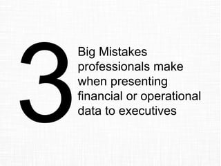
- 1. Big Mistakes professionals make when presenting financial or operational data to executives
- 2. My name is Dave Paradi of ThinkOutsideTheSlide.com, and over the last 14 years of working with presenters, I see professionals make three big mistakes when they present numbers to executives. Let’s start with Mistake #3.
- 3. Mistake #3 Love of Numbers 235% 235% 235%
- 4. Professionals make a mistake when they think that the executives love numbers as much as they do and, therefore, the executives must want to see all the numbers. While an executive might have risen from a financial role into their current role, they no longer have time to figure out all the numbers.
- 5. It is a mistake to put every calculation on the slide and hope they figure out the important numbers out of the 600 numbers in the spreadsheet Network Costs Costs
- 6. It is a mistake to put the whole financial statement on the slide and expect the executives to follow along while you use a laser pointer to point out a few key figures
- 7. ABC Business Unit Sales Projections all figures in thousands Q1 2013 Q2 2013 Q3 2013 Q4 2013 2013 Total Q1 2014 Q2 2014 Q3 2014 Q4 2014 2014 Total $ diff % diff Product A 151 582 313 304 1350 376 387 427 533 1723 373 27.6% Product B 151 221 252 213 837 278 148 421 363 1210 373 44.6% Product C 460 388 279 229 1356 177 399 502 498 1576 220 16.2% Product D 132 214 423 481 1250 450 582 199 179 1410 160 12.8% Product E 260 183 567 126 1136 470 493 360 190 1513 377 33.2% Total 1154 1588 1834 1353 5929 1751 2009 1909 1763 7432 1503 25.3% It is a mistake to put the last eight quarters of data on a slide when all they really need to know is the difference between the years
- 8. When the executives are confused, they won’t make decisions Overwhelming the executives with numbers leaves them confused Delayed decisions cost your organization
- 9. How can you fix this mistake? Focus on the insights, not the data or information.
- 10. Data is anything we measure. And we measure more today than ever before. But data is only a number. It doesn’t have meaning on its own.
- 11. Measured value Desired value We turn it into information by comparing it to some desired standard. Like our goal, industry average, competitor’s market share, or last year’s number. Now we know if it is above or below the desired level.
- 12. If we stop at information, and many presenters stop here, we are short changing the executives and not giving them what they really want. They want the insights.
- 13. The insight is what the results of the analysis mean in the context of your business. What does your analysis mean for these executives? How will it help them make a better decision? That’s what they need to hear from you. Insight!
- 14. Here is an example of moving from data to information to insight 62 transactions last month This is just data 62 > goal of 60 We are above our goal! Hooray! Now we have information, but it still isn’t what the executives need. What the executives need is the insight
- 15. Number of transactions continues to drop each month; will not meet goal next month 0 10 20 30 40 50 60 70 80 90 Jan Feb Mar Apr May June July Transactions per month (est. for July) Goal of 60 per month Goal not met in July!
- 16. Number of transactions continues to drop each month; will not meet goal next month 0 10 20 30 40 50 60 70 80 90 Jan Feb Mar Apr May June July Transactions per month (est. for July) Goal of 60 per month Goal not met in July!With this insight, the executives know that urgent action needs to be taken. With just data or information, this would have been missed.
- 17. To fix the mistake of Love of Numbers, focus on the insights the executives need to know. What do the numbers mean to your business? After all, that is what they are paying you to determine from your analysis.
- 18. Mistake #2 No Clear Messages
- 19. Professionals make a mistake when they think that the executives will be able to follow a presentation that has no clear path or conclusion. Don’t expect the executives to put together your randomly assembled facts into a coherent message. They won’t do it.
- 20. When you start creating your presentation by copying and pasting slides from a previous presentation, it will be difficult to assemble the slides into a coherent message.
- 21. Agenda • Topic 1 • Topic 2 • Topic 3 • Topic 4 • Topic 5 Arranging your presentation as a list of the topics you analyzed won’t help the executives.
- 22. Agenda • Product Income • Services Income • Fixed Expenses • Variable Expenses • One-time expenses Arranging your presentation by the sections of the financial statement isn’t any better. They still don’t know why they should spend valuable time listening to you.
- 23. So they ask you to go back and do more analysis (in the hope that next time they will get something useful) The executives don’t know what to do with all the information The executives get frustrated. Which doesn’t help your career potential.
- 24. How can you fix this mistake? Create a clear plan to take the executives from where they are to where you want them to be at the end of the presentation. Your presentation needs to be well structured.
- 25. Start with the goal of your presentation by completing this sentence: At the end of the presentation, the executives will _____. What will they do, agree on, approve, etc. Be clear on what the outcome of your work on this presentation will be.
- 26. At the end of the presentation, the executives will … Where are they now? Key steps along the journey with points & supporting information Map out your presentation like a GPS unit would for a trip. Figure out the topics, points, and supporting information you need to present in order to reach your presentation goal. Numbers are only the underlying measurement of a story happening in your business. The executives want to hear that story. Read more about the GPS approach.
- 27. Make sure each slide makes only one clear point. Write a headline for each slide that summarizes the point you want the executives to understand from that slide. Yes, this means your slide headlines will be 6-10 words long. Headlines make it easier for you to present because you know the point you need to make, then you can move on to the next slide. Remember this example from before. Even without the visual, the executives would know what the message was.
- 28. To fix the mistake of No Clear Messages, plan the content of your presentation before you ever create a single slide. Don’t just copy and paste slides from another presentation. Define the goal of the presentation. Decide on the topics, points, and supporting information you will need. Write a headline for each slide that summarizes the message. A well structured presentation is easier for you to present and easier for the executives to act on.
- 29. Mistake #1 Spreadsheets on Slides November November YTD USD Million @ B09 rate 2008 Actual 2009 Budget 2009 Base case 2009 Actual 2009 vs. 2008 2009 vs. Budget 2009 vs. Base case 2008 Actual 2009 Budget 2009 Base case 2009 Actual 2009 vs. 2008 2009 vs. Budget 2009 vs. Base case a US COMMERCIAL 2.2 3.0 3.9 4.3 2.2 1.4 0.5 58.2 66.3 56.6 53.5 (4.7) (12.8) (3.1) EBITDA as % of Revenues 6.3% 9.3% 13.2% 14.2% 12.9% 16.4% 15.7% 14.8% a US GOVERNMENT 2.7 0.9 1.3 2.4 (0.3) 1.5 1.1 41.2 23.9 24.2 33.3 (7.9) 9.4 9.2 EBITDA as % of Revenues 24.6% 9.8% 13.8% 23.1% 30.4% 19.5% 20.1% 25.7% a CANADA 0.9 1.1 1.1 1.1 0.2 (0.1) (0.0) 9.4 9.8 9.9 8.8 (1) (1.0) (1.2) EBITDA as % of Revenues 18.0% 24.2% 25.6% 23.6% 17.0% 19.6% 20.9% 18.7% a GLOBAL MATRIX 0.0 0.1 - 0.0 (0.0) (0.1) 0.0 0 0 - 0 0.2 0.4 0.5 EBITDA as % of Revenues 23.9% 34.6% 1.5% 12.6% 6.9% 26.3% NORTH AMERICA 5.8 5.1 6.3 7.8 2.0 2.8 1.6 109.0 100.2 90.7 96.1 (12.9) (4.1) 5.4 EBITDA as % of Revenues 11.5% 11.0% 14.6% 17.1% 16.9% 17.3% 17.2% 17.8%
- 30. Professionals make a mistake when they use a spreadsheet on a slide instead of an effective visual. Spreadsheets are for calculation, not communication.
- 31. November November YTD USD Million @ B09 rate 2008 Actual 2009 Budget 2009 Base case 2009 Actual 2009 vs. 2008 2009 vs. Budget 2009 vs. Base case 2008 Actual 2009 Budget 2009 Base case 2009 Actual 2009 vs. 2008 2009 vs. Budget 2009 vs. Base case a US COMMERCIAL 2.2 3.0 3.9 4.3 2.2 1.4 0.5 58.2 66.3 56.6 53.5 (4.7) (12.8) (3.1) EBITDA as % of Revenues 6.3% 9.3% 13.2% 14.2% 12.9% 16.4% 15.7% 14.8% a US GOVERNMENT 2.7 0.9 1.3 2.4 (0.3) 1.5 1.1 41.2 23.9 24.2 33.3 (7.9) 9.4 9.2 EBITDA as % of Revenues 24.6% 9.8% 13.8% 23.1% 30.4% 19.5% 20.1% 25.7% a CANADA 0.9 1.1 1.1 1.1 0.2 (0.1) (0.0) 9.4 9.8 9.9 8.8 (1) (1.0) (1.2) EBITDA as % of Revenues 18.0% 24.2% 25.6% 23.6% 17.0% 19.6% 20.9% 18.7% a GLOBAL MATRIX 0.0 0.1 - 0.0 (0.0) (0.1) 0.0 0 0 - 0 0.2 0.4 0.5 EBITDA as % of Revenues 23.9% 34.6% 1.5% 12.6% 6.9% 26.3% NORTH AMERICA 5.8 5.1 6.3 7.8 2.0 2.8 1.6 109.0 100.2 90.7 96.1 (12.9) (4.1) 5.4 EBITDA as % of Revenues 11.5% 11.0% 14.6% 17.1% 16.9% 17.3% 17.2% 17.8% When you put the whole spreadsheet on the slide, you hope the executives figure it out. What if they can’t? Or they try, but come to a different conclusion than the one you wanted them to come to? That’s risky. For your presentation. And your career.
- 32. Why do so many professionals use spreadsheets instead of effective visuals? They tell me two reasons above all others: 1) They were never taught how to translate numbers into visuals in school, grad school, or their professional designation 2) They think they need to be a graphic artist to create the visuals they see in print publications
- 33. I believe almost any professional can create effective visuals instead of using spreadsheets. I am proof. I have a Chemical Engineering undergrad degree and an MBA. No design background or experience. I’ve spent 14 years figuring out how to create effective visuals when you don’t have a background in graphics. Here’s what I have discovered.
- 34. You need a process. Here is the one I use. Message Visual Category Select Visual Create Visual
- 35. You need a process. Here is the one I use. Message Visual Category Select Visual Create Visual Start with the message of the slide. Remember the headline your wrote? That’s where you start.
- 36. You need a process. Here is the one I use. Message Visual Category Select Visual Create Visual Start with the message of the slide. Remember the headline your wrote? That’s where you start. Determine which category the message falls into. I use six categories to organize visuals.
- 37. You need a process. Here is the one I use. Message Visual Category Select Visual Create Visual Start with the message of the slide. Remember the headline your wrote? That’s where you start. Determine which category the message falls into. I use six categories to organize visuals. Select the visual from the ones in that category.
- 38. You need a process. Here is the one I use. Message Visual Category Select Visual Create Visual Start with the message of the slide. Remember the headline your wrote? That’s where you start. Determine which category the message falls into. I use six categories to organize visuals. Select the visual from the ones in that category. Create the visual using the tools in PowerPoint.
- 39. When I share this process, many professionals say there are two roadblocks to them using the process: 1) They don’t have a categorized library of effective visuals to choose from 2) They don’t have the skills in PowerPoint to create effective visuals Let me address these two issues.
- 40. Numbers Sequence Time Entities Object Example6 categories 30 groups & sub-groups 66 visuals Comparing numbers/ value/size Relationship of sequence Relationship over time Relationship between entities A person, place, or object An example or demonstration In my book Select Effective Visuals, I organize 66 visuals business presenters should use into six categories, then break those down into 30 groups and sub-groups
- 41. Once you have selected a visual, how do you learn the skills to create it? I have over 30 PowerPoint video tutorials on my website at ThinkOutsideTheSlide.com that will get you started. I’ve also published my Implementation Guides that give step-by-step instructions with screen shots (this is the handout my customized workshop participants get).
- 42. To fix the mistake of Spreadsheets on Slides, use a process to identify an effective visual for your message and create that visual in PowerPoint. You don’t need a graphics background, you can learn the skills you need.
- 43. Let’s recap the 3 mistakes & how you can fix them. Mistake Love of Numbers No Clear Messages Spreadsheets on Slides How you can fix the mistake Focus on the insights the executives need to know, not just the data or information. Plan the content of your presentation with topics, points, and supporting information. Write a headline for each slide. Use a process to identify an effective visual for your message and create that visual in PowerPoint.
- 44. If you would like me to help your team create presentations that have a clear message with focused content and effective visuals, get in touch: P: 905-510-4911 E: Dave@ThinkOutsideTheSlide.com W: www.ThinkOutsideTheSlide.com