Best Practices for Great Landing Page Design @allisonhaag
•
349 likes•77,964 views

Read the full post: http://bit.ly/1O3hZ2Z One of the easiest ways to increase conversions is with a great landing page. Discover the best practices in landing page design in this detailed guide and SlideShare.

Recommended
Recommended
More Related Content
Recently uploaded
Recently uploaded (20)
Featured
Featured (20)
Best Practices for Great Landing Page Design @allisonhaag
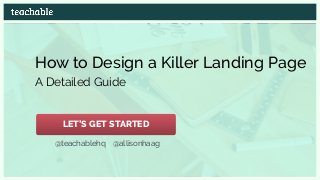
- 1. How to Design a Killer Landing Page A Detailed Guide @teachablehq @allisonhaag LET’S GET STARTED
- 2. Hi, I’m Allison Content Marketer & Designer @teachablehq @allisonhaag We make it easy for over 5,000 people to teach their own online courses.
- 4. This page looks awesome, right?
- 5. It converts at 20-30% (depending on the source)
- 6. Do you want to build your own similar looking landing page and create your own online course? GET STARTED NOW FOR FREE
- 7. Curious how we designed our landing pages?!
- 8. I will explain! Curious how we designed our landing pages?!
- 9. In this presentation, you’re going to learn the best practices on how to create landing pages that convert, look awesome and support your brand
- 10. Before we get into it, let’s define a landing page
- 11. “as a single page with a specific target: getting visitors to complete an action.” Wix.com defines a landing page AKA CONVERSION
- 12. Don’t confuse it with a homepage…
- 13. A homepage should appeal to multiple audiences. It’s the place where anyone can see your product
- 14. As a website with one target audience and goal We define a landing page AKA CONVERSION
- 15. I think you’re getting the idea… Your goal is to get your target audience to sign up for your offer
- 16. Sign up for your newsletter Subscribe to your blog Download an ebook Attend a live webinar Enroll in a course LIKE… I think you’re getting the idea… Your goal is to get your target audience to sign up for your offer
- 17. CONVERSION RATE People who completed your goal People who came to your page MATH! =
- 18. What is your offer? Before you start, have an answer to these 4 questions:
- 19. What is your offer? What are the benefits? Before you start, have an answer to these 4 questions:
- 20. What is your offer? Why does your audience need your offer now? What are the benefits? Before you start, have an answer to these 4 questions:
- 21. Before you start, have an answer to these 4 questions: What is your offer? How do they get your offer? Why does your audience need your offer now? What are the benefits?
- 22. The answers to the questions create your unique value proposition
- 23. They tell your reader… what they get from you when signing up
- 24. They tell your reader… why they can’t live without your offer what they get from you when signing up
- 25. They tell your reader… all while creating a sense of urgency in an easy to convert landing page why they can’t live without your offer what they get from you when signing up
- 26. Sounds complicated, but it’s not! Image source: Flickr
- 27. Here are 46 tips to make building your landing page EASY!
- 28. Teachable 1 TIP Products to build a landing page Instapage Unbounce (instapage.com) (unbounce.com) (teachable.com)
- 29. Copy, images, layout: everything supports your conversion goal Headline Subhead Benefits Social Proof Color Typography 2 TIP ABC
- 30. A great aesthetic supports your brand goals and can lead to future conversions
- 31. COPY Write copy in the voice of your audience 3 TIP
- 33. What are they getting from your product? COPY How are you solving their painful problem?
- 35. Keep copy: Clear Concise Engaging Persuasive COPY 5 TIP Don’t confuse your audience about what they’re getting from your offer
- 36. To captivate your audience, use D Bnonn Tennant’s hypnotic words: COPY 6 TIP YOU BECAUSE IMAGINE
- 37. COPY For more writing advice, Teachable’s Content Marketer & Writer, Ashley Hockney, wrote a great post about her 10 Tips for More Powerful Copywriting READ THE POST NOW
- 38. Your headline needs to say what your landing page is offering COPY: HEADLINE 7 TIP
- 39. Your headline needs to say what your landing page is offering COPY: HEADLINE 7 TIP
- 40. Your subhead is a more detailed explanation of your headline COPY: SUBHEAD 8 TIP
- 41. COPY: SUBHEAD 8 TIP Your subhead is a more detailed explanation of your headline
- 42. In the benefits section, address how you’re solving your audience’s pain points COPY: BENEFITS 9 TIP
- 43. In the benefits section, address how you’re solving your audience’s pain points COPY: BENEFITS 9 TIP
- 44. In the benefits section, address how you’re solving your audience’s pain points COPY: BENEFITS 9 TIP Unsure of the pain points? Check out Teachable Co- Founder, Conrad Wadowski’s post explaining how to find them READ THE POST NOW
- 45. Use a list to showcase how you’re solving the pain points COPY: BENEFITS 10 TIP
- 46. Use a list to showcase how you’re solving the pain points COPY: BENEFITS 10 TIP
- 47. Focus solely on the benefits of your product COPY: BENEFITS 11 TIP
- 48. You need to first sell your audience first on why they need your product (aka how it solves their problem) COPY: BENEFITS
- 49. Including all of the features of your product can confuse or complicate their purchasing decision, which can cause them to not buy at all COPY: BENEFITS
- 50. If you’ve enjoyed these tips so far, check out my detailed blog post: Best Practices to Create Great Landing Page Design READ THE POST NOW
- 51. Include testimonials… COPY: SOCIAL PROOF 12 TIP
- 53. COPY: SOCIAL PROOF …social proof
- 54. The more people see that others are interested in/ used your product, the more likely they will convert COPY: SOCIAL PROOF
- 55. Have a clear call-to-action button CALL-TO-ACTION 13 TIP
- 56. CALL-TO-ACTION
- 57. Michael Aagaard points out that there are two main elements to a CTA CALL-TO-ACTION
- 58. Michael Aagaard points out that there are two main elements to a CTA The visual cue to the audience of where to click CALL-TO-ACTION DESIGN
- 59. Michael Aagaard points out that there are two main elements to a CTA The visual cue to the audience of where to click CALL-TO-ACTION Answers the question of why click the button DESIGN COPY
- 60. Enclose your CTA in a rounded shape CTA: DESIGN 14 TIP
- 61. Enclose your CTA in a rounded shape AKA MAKE IT A BUTTON! CTA: DESIGN 14 TIP
- 62. Give your CTA 3D elements CTA: DESIGN 15 TIP
- 63. Like changing color/shade when hovering over the button CTA: DESIGN
- 65. Your CTA needs to stand out from everything else on the page CTA: DESIGN
- 67. Make the button larger than the other elements CTA: DESIGN
- 68. CTA: DESIGN 18 TIP Include extra white space around the button to make it stand out even more
- 69. Product complexity determines CTA placement above or below the fold CTA: DESIGN 19 TIP
- 70. According to Kissmetrics… CTA: DESIGN The more complex the offer, place below the fold Product/offer complexity CTAplacement Complex Simple BottomofpageTopofpage
- 71. According to Kissmetrics… CTA: DESIGN If there is limited information needed to make a decision, above the fold The more complex the offer, place below the fold Product/offer complexity CTAplacement Complex Simple BottomofpageTopofpage
- 72. Be descriptive when writing CTA copy CTA: COPY 20 TIP
- 73. Tell the reader exactly what will happen when they click the CTA button CTA: COPY
- 75. CTA: COPY TRY SIGN UP LEARN MORE ENROLL NOW REDEEM OFFER DOWNLOAD NOW REGISTER FOR WEBINAR
- 76. Include a thank you page THANK YOU PAGE 22 TIP
- 77. It’s a bonus page! Use it to… Introduce other products, a blog, an online course THANK YOU PAGE Give a bonus piece of content (they’ll love you for it) Attend a live training webinar Follow your social networks Ask them to sign up for your newsletter +
- 78. Have a clear visual hierarchy to make your value proposition obvious DESIGN 23 TIP
- 80. DESIGN Like this landing page design? Sign up on Teachable to create your own school for free! GET STARTED NOW
- 81. Use a simple, clean page design to make your value proposition obvious DESIGN 24 TIP
- 82. Use white space to… DESIGN 25 TIP …allow the viewer’s eyes to move easily around the page
- 83. Use white space to… DESIGN 25 TIP …allow the viewer’s eyes to move easily around the page …emphasize what’s important
- 84. Limit off-page navigation links They direct your viewer off your page and away from your main CTA DESIGN 26 TIP
- 85. Consider psychological color implications DESIGN: COLOR 27 TIP Icon: Flaticon
- 86. Youthful Optimistic Energy Urgency Courage Warmth Trust Security Aggressive Excitement/Fun Feminine Romantic Tranquility Sexuality Soothing Calming DESIGN: COLOR What characteristics do you want your brand to exude? Creative Friendly Luxury Truth Loyalty Coolness Wealth Health Balance Relaxing Easy-going Environment
- 87. DESIGN: COLOR Black makes Squarespace look sleek and high-end
- 88. DESIGN: COLOR Yellow portrays Geico as friendly and optimistic
- 89. Tailor color choices to your audience’s preferences DESIGN: COLOR 28 TIP
- 90. DESIGN: COLOR For a female-focused audience… (Stick to softer tints)
- 91. DESIGN: COLOR For a male-focused audience… (Go for bolder shades)
- 92. Research color palettes for inspiration DESIGN: COLOR 29 TIP Icon: Flaticon
- 93. My favorite sites: Adobe Color DESIGN: COLOR
- 94. DESIGN: COLOR My favorite sites: Colour Lovers
- 95. DESIGN: COLOR My favorite sites: Coolors
- 96. Make sure colors don’t impair readability DESIGN: COLOR 30 TIP
- 97. Easy to read Hard to read DESIGN: COLOR
- 98. DESIGN: COLOR 31 TIP Use a light colored background with dark text
- 99. Use a light colored background with dark text DESIGN: COLOR 31 TIP (or vice versa)
- 101. DESIGN: TYPOGRAPHY 32 TIP You will have less problems with browser compatibility
- 102. DESIGN: TYPOGRAPHY Sans serif (best for mobile reading) Verdana Geneva Arial Helvetica Tahoma Trebuchet MS Lucida Grande Serif (inspires feelings of trust) Georgia Times New Roman Palatino Times Monospace Courier Monaco Courier New Best fonts to use:
- 103. Use one font to reduce clutter on the site DESIGN: TYPOGRAPHY 33 TIP
- 104. Use 12pt font for body text DESIGN: TYPOGRAPHY 34 TIP (It’s the easiest to read in the least amount of time)
- 105. For an older audience, use 14pt font DESIGN: TYPOGRAPHY 35 TIP
- 106. For headlines, use 17-25pt DESIGN: TYPOGRAPHY 36 TIP
- 107. Make sure there is enough space between each line to give the text room to breathe and be read easily DESIGN: TYPOGRAPHY 37 TIP
- 108. DESIGN: TYPOGRAPHY 37 TIP Make sure there is enough space between each line to give the text room to breathe and be read easily
- 109. Include an image of your product OR a captivating image supporting your offer IMAGES 38 TIP
- 112. We are visual beings IMAGES Image source: The Next Web
- 113. Visuals entice your reader to stay on your page and learn more about your product IMAGES
- 114. Use images with people IMAGES 39 TIP
- 115. IMAGES We are drawn to faces, especially the eyes
- 116. IMAGES When the eyes are looking in a certain direction, we follow the line of sight. This is a psychological trick that influences the power of suggestion
- 117. Use eyes to focus attention on the important parts of your landing page IMAGES 40 TIP
- 118. Use directional cues to point out where to look next IMAGES 41 TIP
- 119. Use directional cues to point out where to look next IMAGES 41 TIP
- 120. The 13 ULTIMATE Free Stock Photo Sites (All free for commercial use) @allisonhaag for your Presentation or Online Course @teachablehq IMAGES 42 TIP To find your perfect visual, check out my list of The 13 Ultimate Free Stock Photo Sites FIND YOUR IMAGE NOW
- 121. If the background is an image, make sure the text is legible by darkening the photo IMAGES 43 TIP
- 122. IMAGES Or try adding a box behind the text
- 123. White text over most images is usually the easiest to read IMAGES 44 TIP
- 124. Use video to explain complex offers IMAGES 45 TIP
- 125. Conduct A/B Tests A/B TESTING 46 TIP
- 126. A/B TESTING We recommend A/B testing every element using Optimizely or Visual Website Optimizer
- 127. Phew! That was beefyImage source: petakidas.com
- 128. Download the slides to remember these tips when you’re creating your own killer landing pages! GET THE SLIDES NOW
- 129. Thanks for staying with me until the end! For more, follow us on Twitter Happy Designing!