

Recommended
More Related Content
Viewers also liked
Viewers also liked (18)
Recently uploaded
Recently uploaded (20)
Q1 Continued..
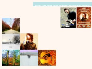
- 1. Ancillary Tasks: Six Fold Digipak and Magazine Advertisement for the Digipak
- 2. Ancillary Task: Digipak During the designing of our Digipak, we agreed that we wanted the album art to be artistic and creative as indie album covers were often creative and diverse. Very few indie album covers had just an image of the artist on them as they were often of creative photography that interprets the lyrics and mood of the song. In the Digipak we wanted to bring together the different seasons and wanted to continue our nature theme. Our music video was predominantly shot outdoors and we were able to capture different seasons. In the editing of our Digipak the front and back cover was worked on as a whole group. The other four panels were worked on individually… We all chose one panel to edit for the Digipak. Typical elements of a Digipak •Album name •Artist name •Image of the artist •Song names •Album Art •Barcode •Lyrics
- 3. This is our front cover. The aim was to have most of the background in shades of black, whites and greys. The balloon was the main part that stands out against the background. Many indie album covers tend to portray something creative and present the artists originality and imagination – an object of beauty to make us look at it and create enigmas to draw us in – who has the balloon and why? The back cover was meant to contrast with the front. The front cover shows a winter and this image is a representation of autumn. We wanted to use vibrant colours to symbolise the beauty of nature and link it to the beauty of love. The list of tracks have been positioned between the trees in the centre of the image possibly to suggest the lyrics or pure and meaningful to the artist and music is the centre of his world. It is also conventional to list the songs. We felt that it was necessary to have an image of the artist as the audience must know who is responsible for the album. He hasn’t yet gained much publicity therefore it was necessary we made him recognisable. We used a close up to emphasise his image. This is also a typical element used in other Digipak’s. We wanted to keep the creativity continuous and keep the nature leaf affect going. This may suggest he is possibly naturally talented.
- 4. We felt that it would be a good idea to include an image of the guitar as there are many shots of the artist playing the guitar in the video. Instruments are often featured in album art. The middle panel was to show the couple walking with footsteps following behind them. To symbolise all the memories they have had together in the past and they are walking towards many more. The purple/blue sky was to represent the love and affection between the couple. Symbolism is often typical of indie album art as the album art allows audiences to imagine for themselves and create links for themselves. This panel was a very simple image to show the beauty of nature and also to represent the life of the artist. The mixture of colours represent the colourful moments and beautiful memories in their life. The use of symbolism is used once again as the image is fairly representative.
- 5. Looking at magazines we found that artists do not always use the same magazine advertisement in all magazines. There are sometimes different adverts for the same album that will be shown in different magazines, presumably to appeal to different audiences and maximise sales. Therefore we thought it would be a good idea to create two different adverts that present the same brand image but may attract different audiences. Ancillary Task: Magazine advertisement for the Digipak Elements that may be found in a Magazine advert •Artist name •Album name •Artist image •Album image •Release date •Previous ratings/quotes
- 6. We have added ratings that magazines have given the album to promote his music. Many other magazine advertisements for new album releases show ratings. This allows audiences to set expectations about how good the album will be especially if they are from trusted sources On both of the adverts we have used an image of the artist to promote him and make him recognisable to audiences. If ‘The Life of Riley’ was already a famous name and artist the image of the artist in the advert would not be necessary as people would able to recognise him by the name. In the two adverts we have used similar images of the artist. In both he is wearing a black shirt and similar images have also been used in the Digipak. Album adverts often feature the artist . Our advertisements hold this similarity. The blue colour of the font of ‘NME’ and ‘MOJO’ was done because in the front cover of the Digipak the colour of the balloon is the same. It was in order to keep similar colour themes throughout the products. The image of the album has only been used on one of the magazine advertisements. We felt that the need of the album advert was not necessary as the image of the artist, the name of the artist and the album name was on the advertisement. Therefore we only used an image of the album on one of the advertisements. When looking at previous advertisements we found that there was not always an image of the album.
- 7. The combination of our products bring something new and different to the indie genre. The visuals throughout our product are very creative and interesting and draw attention towards them. Personally, I am not a great fan of indie music but if I was to see this album in a music store (HMV), I would attempt to go out and listen to the album and view the music video merely based on the creative visuals and imaginative art work in the Digipak. I feel that it would have the same impact on others that may come across it as visual presentation plays a large part in whether or not you go onto purchase something. Conclusion